
Ficheiro:Budget Deficit and Public Debt to GDP in 2012 (for selected EU Members).png

Dimensões desta antevisão: 800 × 600 píxeis. Outras resoluções: 320 × 240 píxeis | 640 × 480 píxeis | 960 × 720 píxeis.
Imagem numa resolução maior (960 × 720 píxeis, tamanho: 65 kB, tipo MIME: image/png)
|
|
Esta imagem provém do Wikimedia Commons, um acervo de conteúdo livre da Wikimedia Foundation que pode ser utilizado por outros projetos.
|
.png)
Descrição do ficheiro
| Descrição |
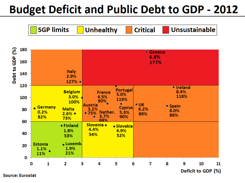
English: The Debt-to-GDP ratio and Budget deficit to GDP ratio have been plotted for all eurozone countries and UK in 2012. The same plot can also be found here with 2009 figures. The figures indicate the fiscal health of the countries in the plot. Generally, the farther up and to the right a country goes, the higher the risk for investors. The following 4 areas have been given a background color in the plot to reflect the level of fiscal health:
|
| Data | |
| Origem | Obra do próprio. Data for the chart is from the Eurostat database[1][2], which normally will be identical with the European Commision's AMECO database[3][4]. In the current version of the file, the figures are based on recorded data for the first 3 quarters and forecasted data for the last 4th quarter of 2012. The data can also be found published by the European Commission's latest Autumn Economic Forecast 2012 report. |
| Autor | Danish Expert |
| Outras versões | العربيَّة |
.png)
-ar.png)

|
Esta imagem de gráficos (ou todas as imagens neste artigo ou categoria) deveriam ser recriadas usando gráficos vectoriais, como ficheiros SVG. Isto tem várias vantagens; veja as Commons:Media for cleanup|imagens para rever para mais informações. Se já criou um ficheiro SVG desta imagem, por favor, carregue-o. Depois do novo ficheiro SVG ter sido carregado, substitua aqui esta predefinição pela predefinição {{vector version available|nome da nova imagem.svg}}.
|
Licenciamento
Eu, titular dos direitos de autor desta obra, publico-a com a seguinte licença:
A utilização deste ficheiro é regulada nos termos da licença Creative Commons - Atribuição-CompartilhaIgual 3.0 Não Adaptada.
- Pode:
- partilhar – copiar, distribuir e transmitir a obra
- recombinar – criar obras derivadas
- De acordo com as seguintes condições:
- atribuição – Tem de fazer a devida atribuição da autoria, fornecer uma hiperligação para a licença e indicar se foram feitas alterações. Pode fazê-lo de qualquer forma razoável, mas não de forma a sugerir que o licenciador o apoia ou subscreve o seu uso da obra.
- partilha nos termos da mesma licença – Se remisturar, transformar ou ampliar o conteúdo, tem de distribuir as suas contribuições com a mesma licença ou uma licença compatível com a original.
Histórico do ficheiro
Clique uma data e hora para ver o ficheiro tal como ele se encontrava nessa altura.
| Data e hora | Miniatura | Dimensões | Utilizador | Comentário | |
|---|---|---|---|---|---|
| atual | 17h47min de 30 de novembro de 2012 | | 960 × 720 (65 kB) | Danish Expert | Data extended to cover all Eurozone countries and UK for comparison. |
| 12h52min de 30 de novembro de 2012 |  | 960 × 720 (55 kB) | Danish Expert | Changed definition for the Unhealthy area, so that it now is more directly related to the official European SGP limits. Meaning that a country now needs to comply with 1 out of 2 fiscal SGP limits (and not exceed by far with the second), in order to be... | |
| 17h12min de 29 de novembro de 2012 |  | 960 × 720 (54 kB) | Danish Expert | Color top-legend added. Y-axis stopped at 180 instead of 200, in order to improve layout with some more whitespace around the top-legend. | |
| 10h26min de 29 de novembro de 2012 |  | 960 × 720 (57 kB) | Danish Expert | Clarified the concept of "unsustainable levels" by introducing a red color for this particular window, and leaving the orrange color only to map the area commonly referred to as "critical levels". | |
| 18h54min de 25 de novembro de 2012 |  | 960 × 720 (57 kB) | Danish Expert | User created page with UploadWizard |
Utilização local do ficheiro
As seguintes 2 páginas usam este ficheiro:
Utilização global do ficheiro
As seguintes wikis usam este ficheiro:
- ar.wikipedia.org
- en.wikipedia.org
- ja.wikipedia.org
.png)